An identity to represent pediatrics
yet unique in the doctor’s personal aesthetic.
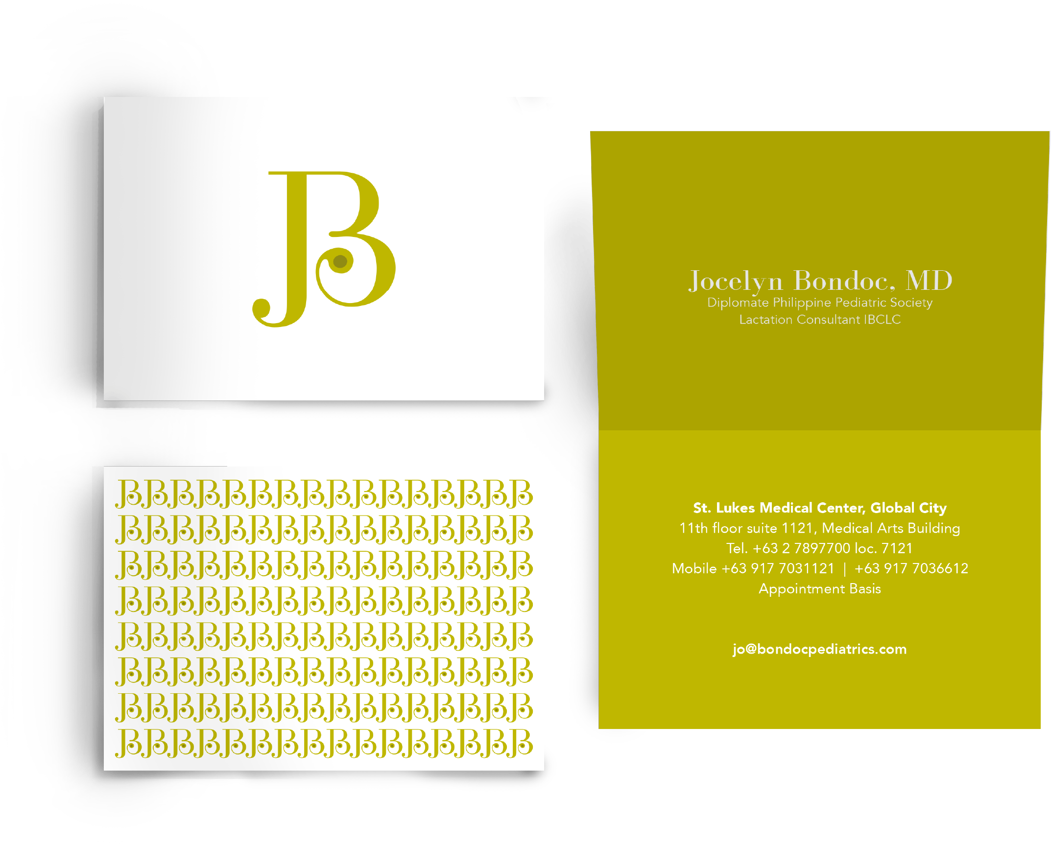
Clinics and pediatrics have a consistent look that can be off-putting or trite to patients and because of this, Dr. Jo Bondoc strongly felt the need to create her own look and identity. We’ve created an identity to best represent her type of work yet unique in her personal aesthetic.
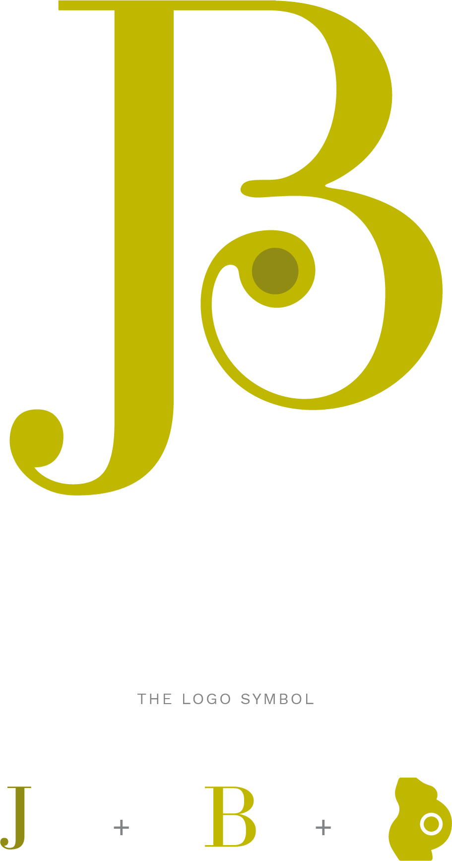
Playfully intertwining the doctor’s initials, the icon represents a mother cradling her soon-to-be-born child—this is executed in a sophisticated way just as the doctor is. The color in bright green is warm and welcoming along with the curves in the icon.
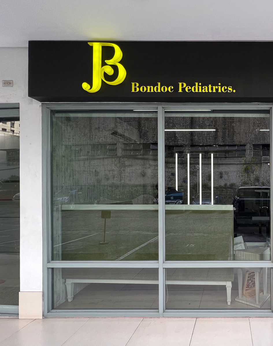
The identity is then cascaded to her materials such as the prescription pad, business card, and the patient’s baby book. Baby books are usually freebies by Medical Representatives and so it was her initiative to brand these for her patients. Afterwards, fellow doctors followed suit in branding their own.